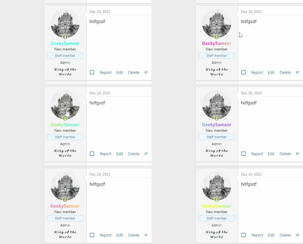
You have possibly seen this kind of effect on many websites, usually used while showcasing portfolios or clients.
In this effect, the whole image is shown in greyscale (black and white) normally, and when you hover over it, you see the actual colors of the image.
This effect can be useful if you have a retro-type forum or a dark theme style.
Take a look at the effect first:

If you want this effect keep reading, if you don’t like this we have many such Xenforo Customization posts, I am sure you will find something you like.
Wondering how we removed the profile popup every time you hover on PP? read it here:
Let’s get back to the topic, to achieve the above effect we are going to use CSS.
Head over to your Xenforo Admin Panel > Appearance > Templates: and search for extra.less.
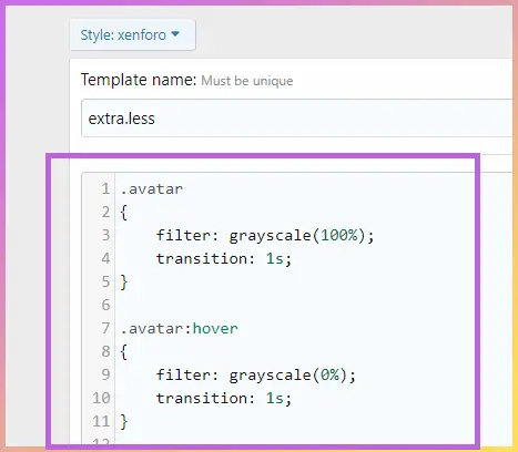
add the following code:
.avatar
{
    filter: grayscale(100%);
    transition: 1s;
}

.avatar:hover
{
    filter: grayscale(0%);
    transition: 1s;
}
Just like this:

Click SAVE and done.
Please note that .avatar in the class for the profile pictures in xenforo default style, this code will work in the default style. But for custom style, you have to find the class of the Profile image. You can find this by right-click on the profile picture and inspect.


